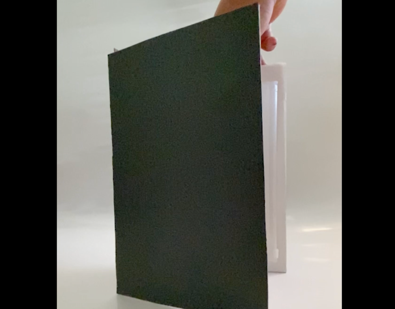
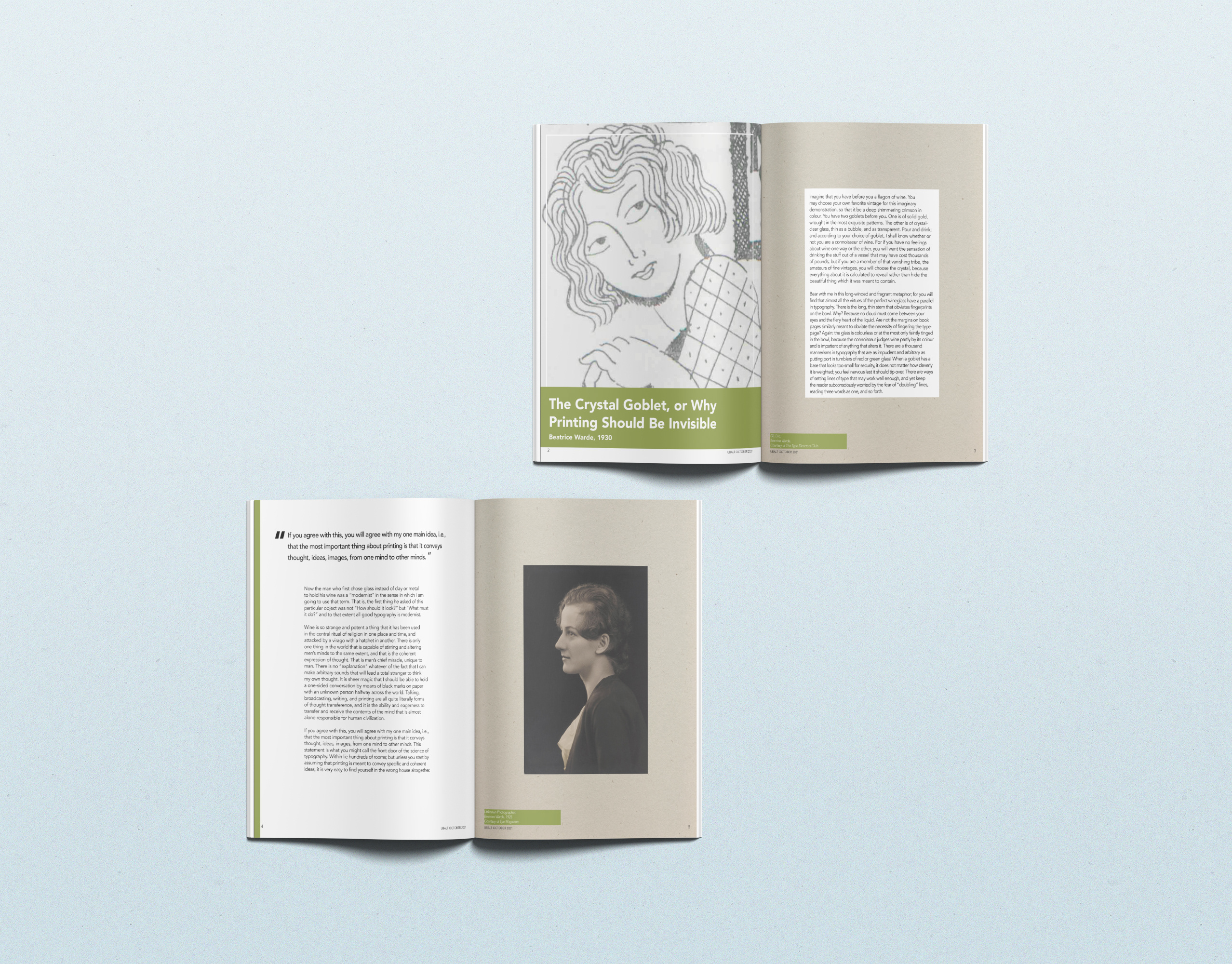
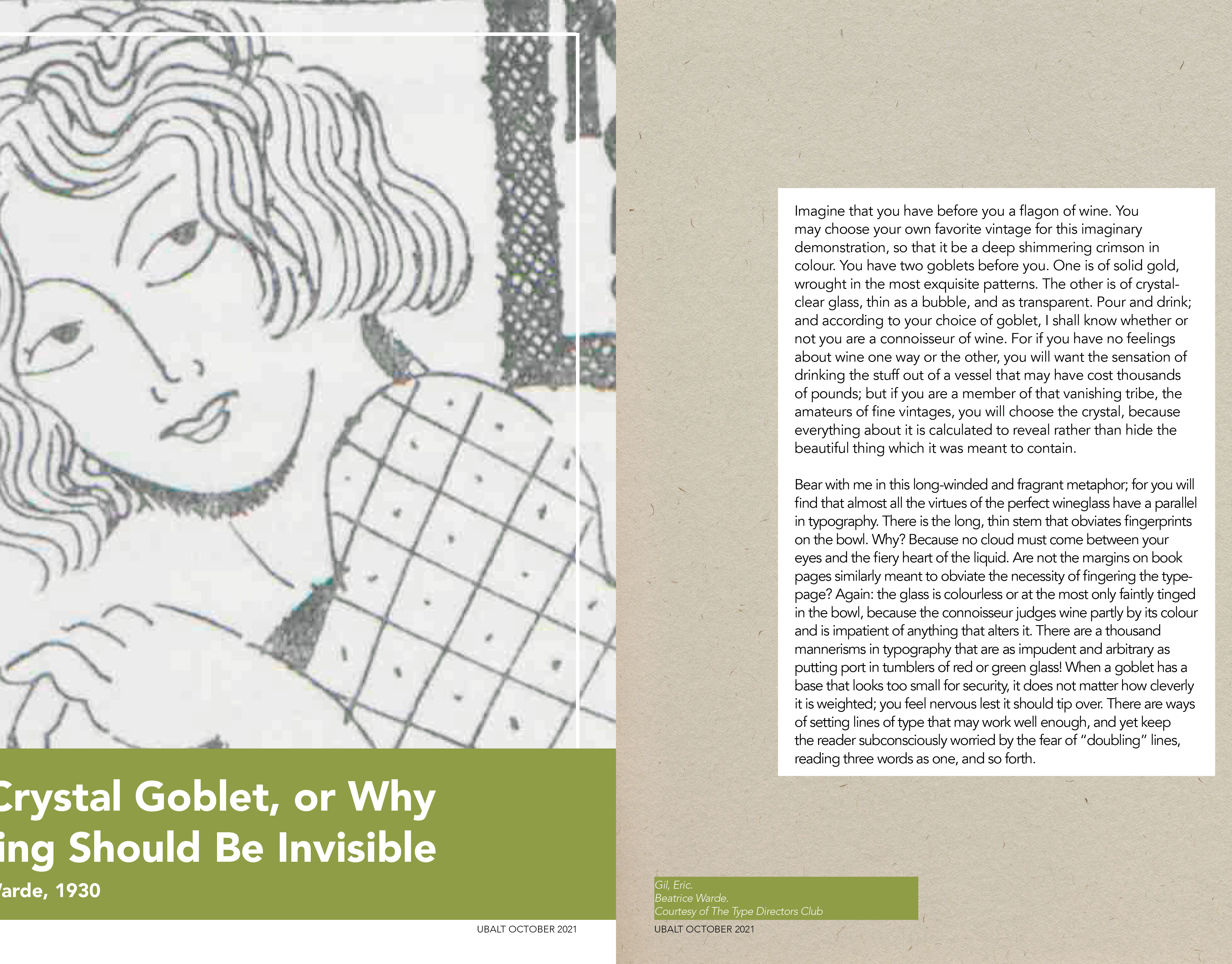
Jo's Journal was created as a personal guide to track my growth throughout the course by exploring typefaces and styles while reflecting on my progress. This journal features weekly digital images incorporating objects from my surroundings, personal replication, and reflections tailored to my needs and style throughout the course. This journal was designed for Typography I at the University of Baltimore in Fall 2021.
The layout remains consistent across all pages. On the left side, two images appear: the top image represents the week's interest, and below is my attempt to replicate it to the best of my ability. While the results weren't always perfect, the intention remained central to each entry. On the right side, a headline indicates the week and key word of interest. Beneath the headline, two questions appear: "What is one thing you want to remember from this reading?" and "What is one thing you confusing from this reading?". My personal responses follow, reflecting my views based on the content from that week's reading.
Despite being a personal project, Jo's Journal has several challenges. One of the greatest obstacles was designing something that reflected my ever-changing style. The journal went through a numerous amount of changes, from layouts to color schemes to overall aesthetics. The initial concept had evolved throughout the rounds of changes before ultimately settling on a neutral palette paired with a bold pattern to create a contrast by balancing out the subtlety with a playful touch.
