"The Crystal Goblet" by Beatrice Warde, first published in 1930, is an essay on Typography, which served as key source as inspiration for the reimagined editorial. This four-page spread was designed using provided information and imagery to be reinterpreted how the editorial would appear today. This design was created specifically for Typography I at the University of Baltimore in Fall 2021.
Throughout the revamping process, a primary focus was to keep typography as the central visual element.
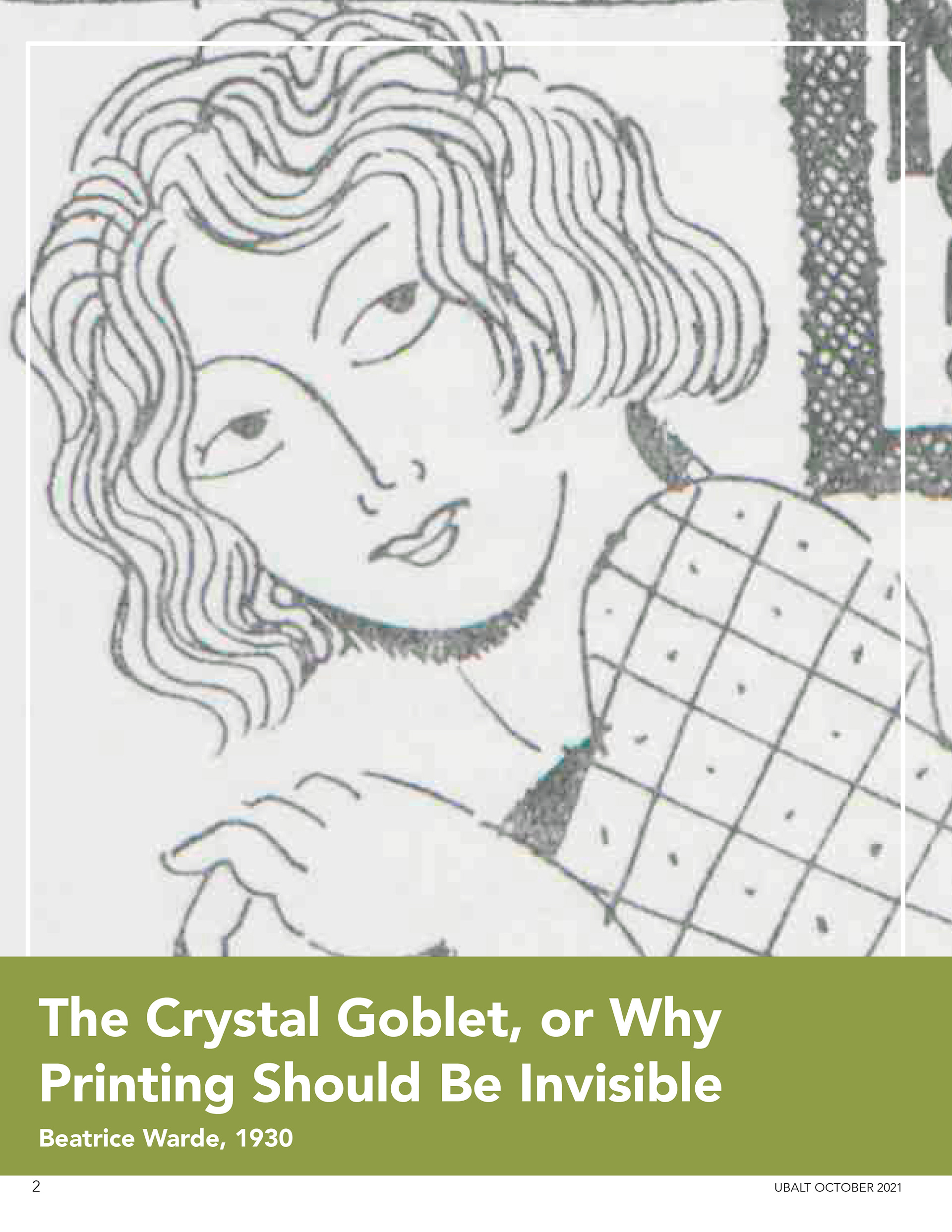
The first page features a large image of Beatrice Warde, with a subtle pop of green to create contrast and draw attention. The following page incorporates the green sparingly, with a textured background frames the text in a tight layout. Despite the green being a primary color in the spread, the text remains the focal point, allowing the viewers attention to be directed towards it.
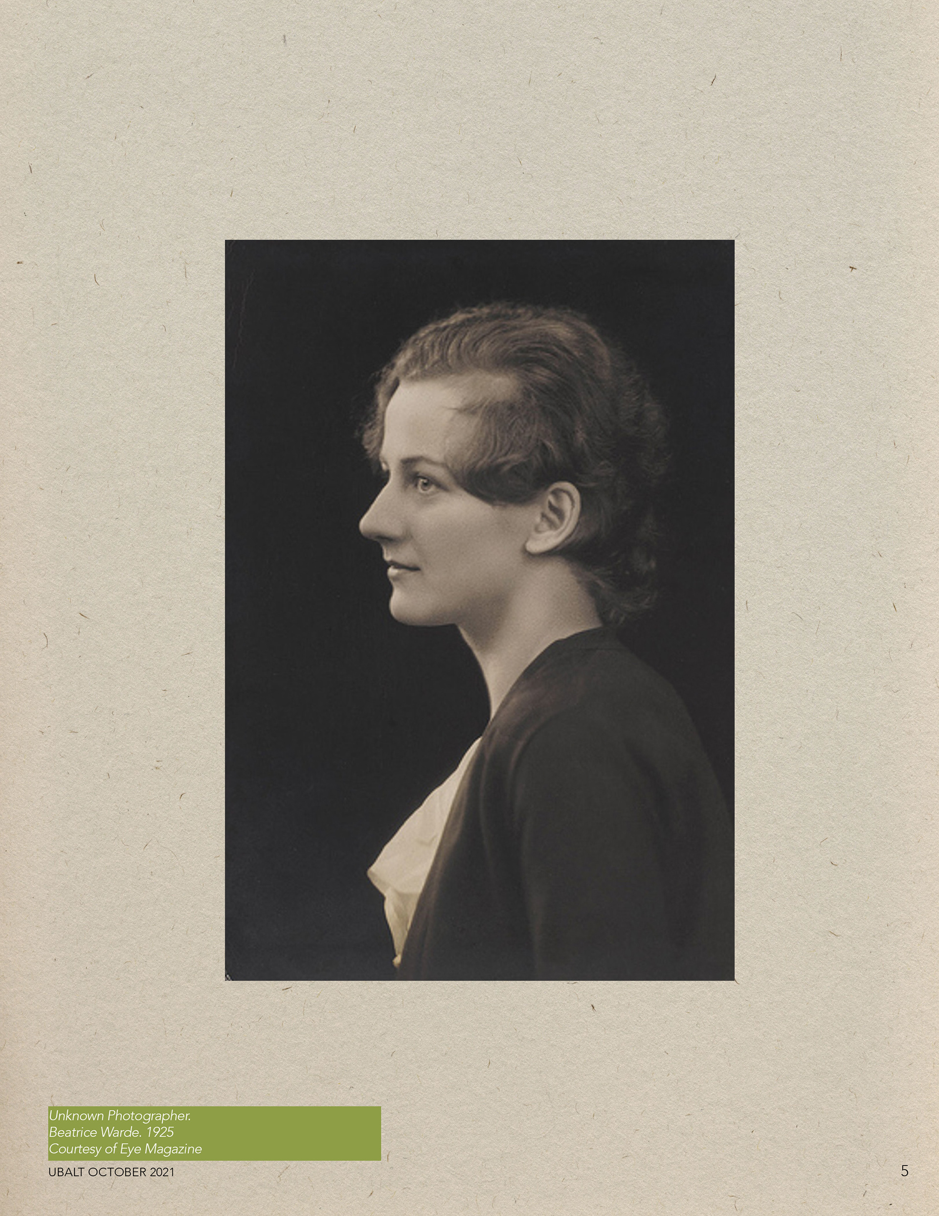
On the final pages, the design kept a similar structure. The left side is text-heavy, with a quote headline followed by a continuation of the text from the previous page. The pop of green appears along on the left edge. On the right side, the image selected complements the text-heavy side, by displaying a portrait of Beatrice centered. The image is set against a light, textured background, creating a subtle contrast, creating an illusion of the portrait being displayed on a wall.
