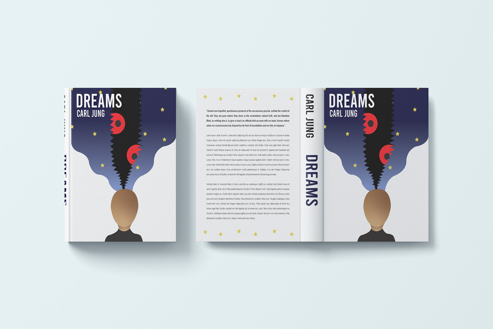
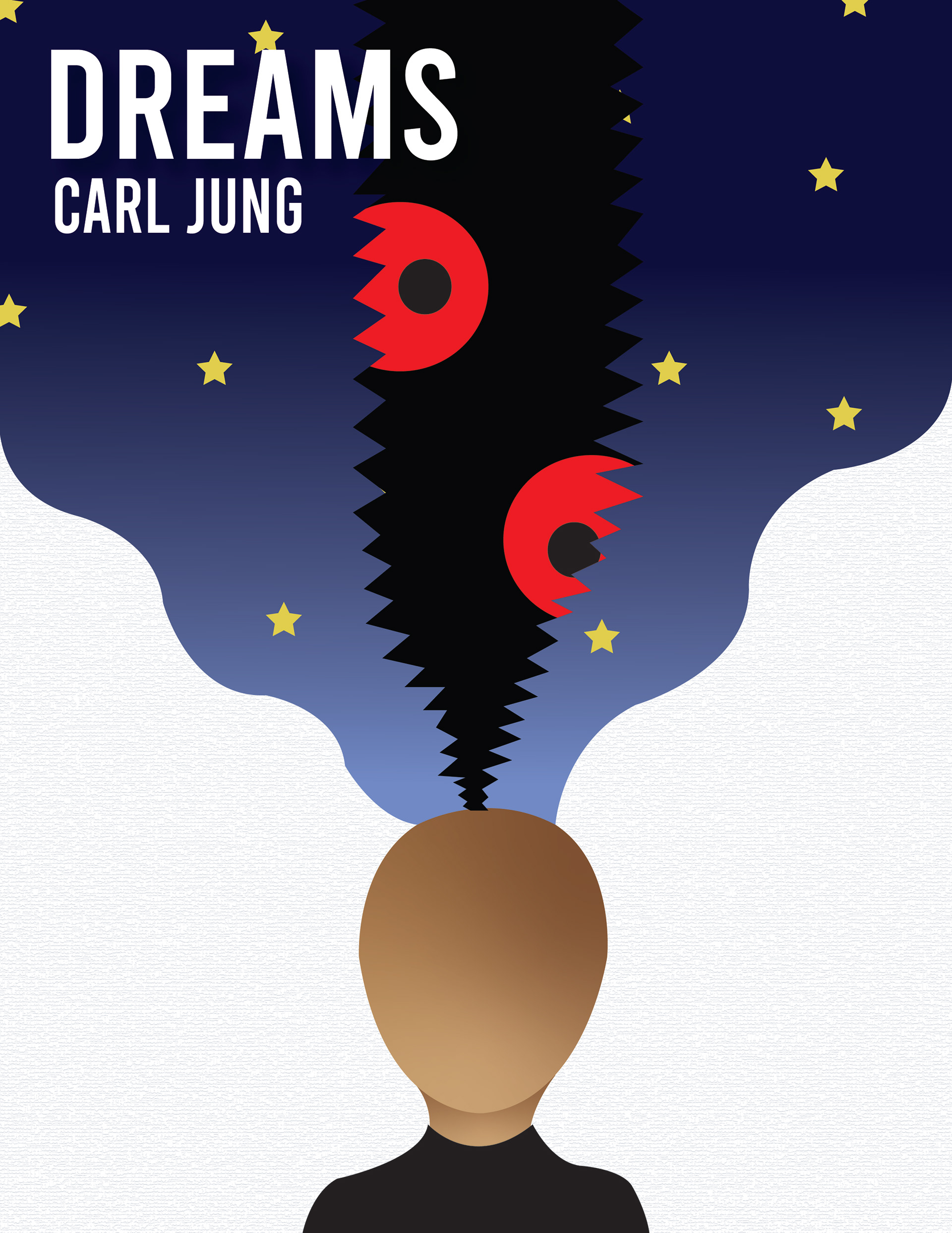
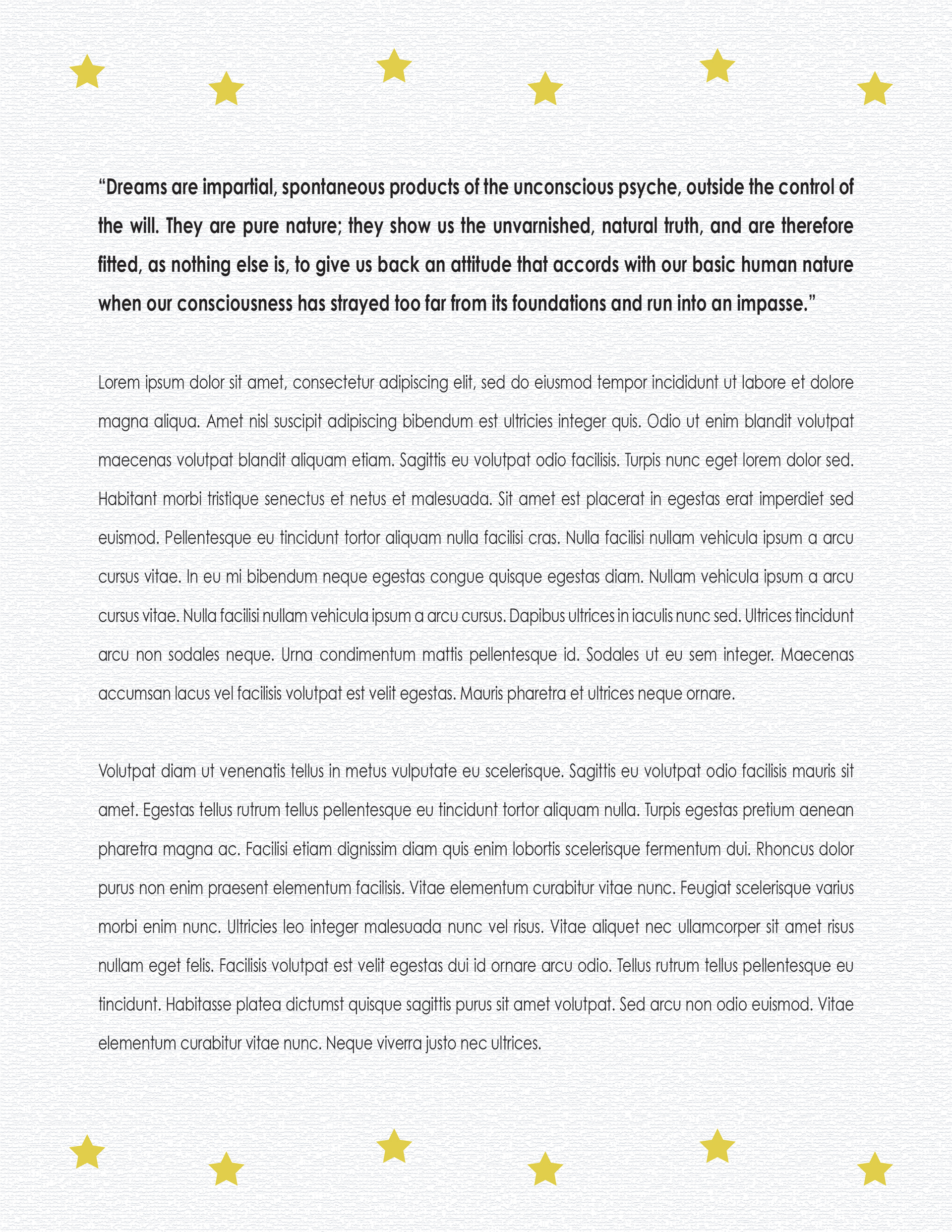
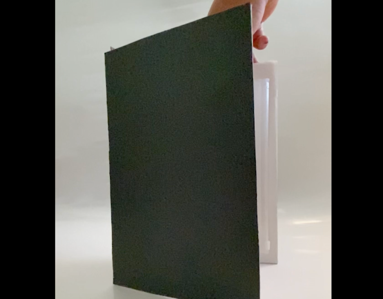
Inspired by the written work of Carl Jung’s “Dreams”, I created a personal interpretation of the subject of dreams. The cover design was intended to visually represent how a peaceful dream can turn into a terrifying nightmare. To emphasize the contrast between the positive and negative aspects of dreams, the use of two palettes was necessary. This design was created for Creative Concepts course at the University of Baltimore in Fall 2021.
The uses of two contrasting palettes visually represent the dual nature of tranquility and fear. The first palette, featuring light tones (off-white and yellow) to capture the serenity of peaceful, airy dreams. It symbolizes the beginning of sleep, when one settles in for needed rest. The second palette, with darker tones (midnight blues to pure black), reflects the intensity and harshness of nightmares, shifting the from a light sleep to an unsettling dream state.
In this iteration, though not visually represented, the face was intended to be replaced with a mirror-like material allowing viewers to see themselves reflected in the design. Despite, this being the final iterations, future iterations would incorporate more of a terrifying nightmare image to be held within the dark space, creating a more intense contrast between the two states of sleep.
